#upcrate49
good in shape
upcrate49
good in shape
MENU
click at the topic to slide directly to them >>>

1. Liquitex Basic Acrylics 22ml tubes
Basics is for all creatives. For all budgets. It’s perfect for all painting techniques including underpainting and sketching. This medium viscosity paint is made with lightfast, artist-quality pigments in an expanded choice of 72 colors.
for a look at all colors click here >>
Quality- Your work has a life beyond you. As with all Liquitex paints, the pigments in Basics acrylic have passed extensive tests for lightfastness. The advanced acrylic formula is highly flexible, durable, non-yellowing and UV-resistant. Your work will have the greatest archival permanence possible, withstanding color shifting or fading to stay vibrant and true.
Fine Art Pigments- All Liquitex paints use the highest quality pigments and go through the same rigorous manufacturing process. The only difference is that with Basics we use a lower concentration of pigment than our professional paints. For Basics, fine art pigments are selected and milled using the latest basket bead-mill technology, in the same way as Soft and Heavy Body Acrylics. Pigments are ground with tiny reinforced ceramic beads to give fine dispersion, great color development, strength and brightness, before being added to the acrylic emulsion.

2. Winsor & Newton Fineliner 0,8
A fineliner that fits every style of sketching, featuring a smoothly tapered nib and a long barrel designed for flexible grip adjustments.
The perfect tool to start every creative project- The Winsor & Newton fineliner delivers incredible detail and its water resistant ink means each fineliner can be used effortlessly with water techniques. Optimised for drawing and sketching at all proficiency levels.
Winsor & Newton fineliners utilise water resistant, non-fading pigment ink, which makes it perfect to use with promarkers, colour pencils or watercolours.
The Winsor & Newton fineliner is consistent and reliable in all nib sizes and colours. Available in Black in 0.05, 0.1, 0.3, 0.5, 0.8 and 1.0 mm. Also available in Cool Grey and Sepia in 0.1, 0.3 and 0.5 mm.

3. Kolibri 596, size 6
The brushes of the “black line” are made of black synthetic fibers, black ferrules, and black handles.
The synthetic fiber is very suitable for both watercolor and acrylic paints. They are very elastic and dimensionally stable, extremely robust and can be cleaned very well. Made in Germany

4. Hanfpaper 14×20 cm, 320gsm, 5 Sheets
Have you ever tried tree-free paper? Since 2022 (hobby-) artists and paper lovers use products made of 100% hemp from @hempa.de to combine their passion with attitude. The German Start-Up not only offers a new level of sustainability but also provides a high quality medium for several creative techniques from acrylic to oil colors. Our upcrate Box #49 features a mini drawing book coming in A5 size with 5 sheets to let your creativity flow.
Express yourself with less chemicals, no trees and try this ecological innovation!

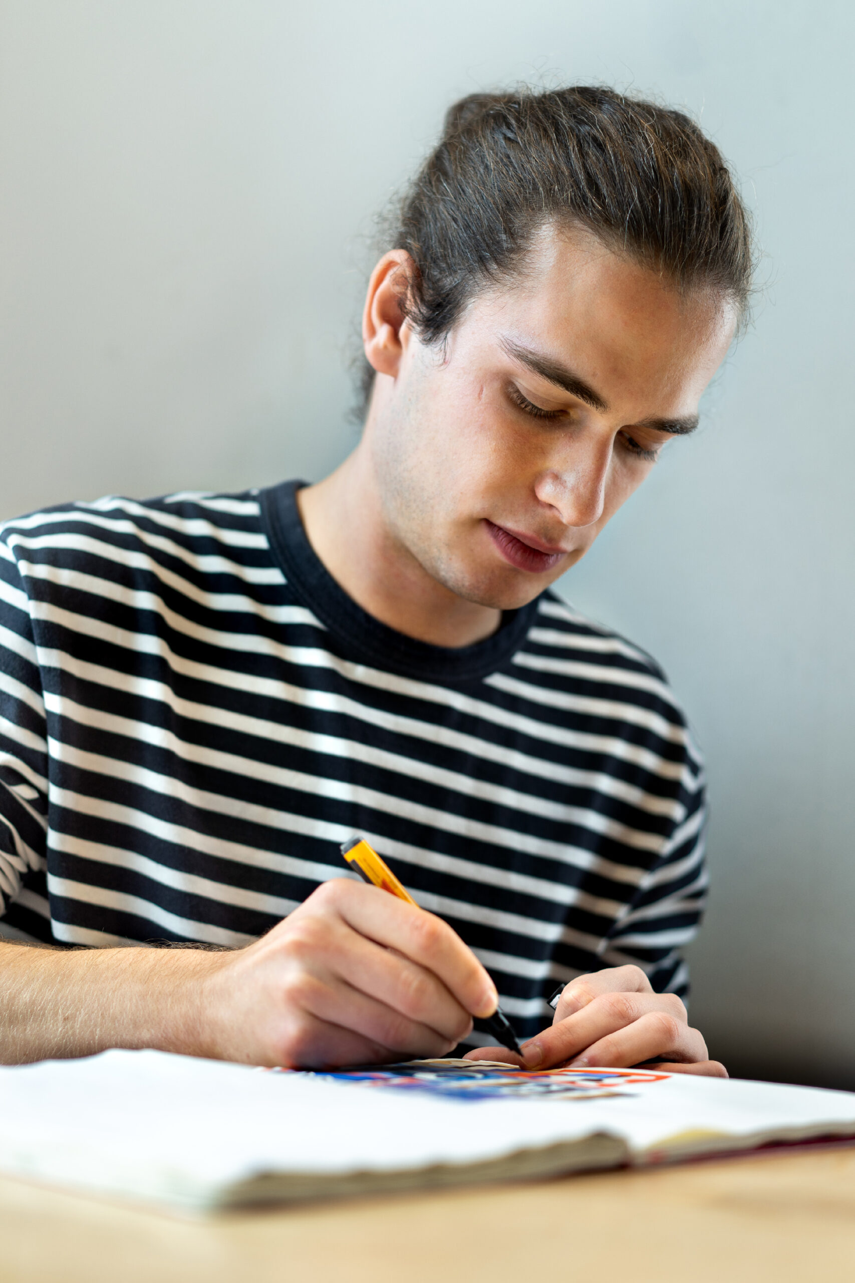
Thanks for having me 🙂 The most exciting and challenging thing was to work with materials that I did not work before. I usually use the same materials that work best for me most of the time. But it’s great to explore something new.
My process is very intuitive. I like those little surprises that come along when you’re drawing. So instead of planning every detail of an image I just start drawing and then react to what I did before. I like working from the outside to the inside. Most of the time I start with a rectangle and a silhouette which becomes the background. And then I fill in some details as a reaction. I’m trying to not overthink my drawings. That’s why I usually take the first idea that comes to mind for the continuation of a drawing. It’s like my natural reaction.
My artistic practice came out of doing Graffiti. An important part of Graffiti is about drawing letters in certain ways so that they transfer a specific emotion. At some point I felt limited by just using letters and drawing them over and over again. So I started to replace them with abstract shapes because they have the same characteristic. An abstract shape does not have to stand for something specific. It’s the viewers decision to decide what they want to see in my work. I really like exploring abstract shapes because this field seems to be endless.
Marc David Spengler (1995) is an artist and illustrator who lives and works in Stuttgart, Germany. He graduated from State Academy of Fine Arts Stuttgart with a diploma in communication design. His works range from illustration to print graphics and have been shown several times in national and international exhibitions. Inspired by graffiti culture, the artist spontaneously creates abstract, colourful compositions that originate in his sketchbooks and playfully deal with the degree of abstraction.

I try to make art as often as possible. Most of the times that means from Monday to Friday on a regular working hour basis. Making art means a lot to me. Creating something that did not exist before is a very satisfying feeling. On the other side I also enjoy the process of creating something. This part can be very meditative and relaxing.
Right now I am working on a book about my sketchbooks which will be released later this year. So I’m looking forward to that.
The rest remains to be seen. As I said before, i like those little surprises along the way.
Every day can be very different, so it’s hard to answer that. I like to spend my time with my girlfriend, meeting. friends, travel and always try to have a good time somehow 🙂


#upcrate49 HOW-TO-DO-VIDEO by Marc David

Hello! This time, a box with very muted colors and a flat brush that works great for rough color blocking, along with a fine liner for more details, shadows, and textures. I must say, these colors were a challenge for me because I usually prefer vibrant ones, so I decided to create a moody and calm still image featuring flowers.
First, as always, I experimented by mixing the colors together to see what spectrum of tones is possible. Then, I started with a solid background.
For the background, I mainly chose the neutral gray color, but to make it more interesting, I also added a touch of blue and lilac. Only a small amount, and not in their pure form, but rather mixed with gray to create subtle shades. Additionally, I varied between using a very dry brush with hardly any color, a bit of color, and also diluted color with water to introduce textures into the color surface.

Then, I defined approximately the lower third of the paper as the ground, slightly slanted, using a light blue mixed from pale pink and blue. I placed the blue as a color accent in the bottom right corner and already painted dark areas (created from brown and blue) to delineate the water glass.

The water glass may initially seem tricky, but if it doesn’t need to be photorealistic, it’s actually quite achievable. Using a light color, you can outline one side of the glass, including the upper edge and the waterline. Then, with a darker color, like blue in this case, outline the other side and add some dark accents to the upper edge and in the water. After that, fill in more with gentle color gradations, leaving about a third of the glass unfilled. Voilà, add a flower stem that appears to be breaking inside the glass and is slightly offset, and the water glass is complete!

I painted the flower shape as a dark lilac area, shaded with blue to add highlights and bring dimension to the flower.

That’s exactly what I did: I added the lilac in different shades with rough shapes on the dark area, not worrying about everything being perfectly recognizable. It’s also interesting to use another color, like brown in different shades, as a color contrast in addition to that.


Now comes the part that I personally enjoyed the most: Using the fine liner to draw all the details. Adding shading to the flowers, little stars, texture in the background, some contours, and the shadows on the surface.

Finally, add the last highlights with light pink, and it’s done!
SAILOR OF THE MONTH
@pannamatena


COLOR CIRCLE WITH LA PETITE RUSE
@lapetiteruse
Hello, artists!
This month is my latest contribution to upcrate magazine. You can find me on instagram if you’d like to continue following my creative adventures! In the meantime, here are my impressions and tips with the materials I received for this box:
liquitex basics paints are good paints to put in everyone’s hands. They’re easy to mix, and you can make them softer by diluting with water, or keep the texture by not adding anything to them. With the colors offered in the box, have fun making color charts to obtain a wider range of colors, gradations and complementary colors.
Don’t hesitate to try making the paint almost transparent by adding lots of water to the color. Once dry, the paint won’t budge and you can also play with superimpositions.
WINSOR and Newton’s 0.8 liner pen is really pleasant to hold, and gives you clear, well-defined lines because it’s a calibrated felt-tip. You can also use it to create outlines before painting, as it’s archival quality so the ink won’t migrate into the paint.
I hope you enjoy your creations, and above all, lots of testing and color play!
Have a nice day!
Émilie.


#upcratebattle
#upcrate48 Amazing entires <3
Topic: MY PLACE
#upcrate49
TOPIC: STACKING PLAN
How many forms do you know? which compositions make sense to you? Play with the white space on your HEMPA paper and fill it with color and shapes. It can be abstract, it can be an object, it can be a stack. In principle, it can be whatever you want it to be. Are there shades? Are there outlines? You decide how you stack your shapes or make them look to each other.
ALL YOU NEED TO DO IS:
1. Use the materials in this month‘s upcrate. Let your creativity run free and create a great work of art
2. Post your artwork on Instagram with #upcratebattle #upcrate49 tag us @upcrate


