
MENU
click at the topic to slide directly to them >>>
Royal Talens is proud to announce a colorful collaboration with Pantone. While Pantone is famous for their universal language of color, Talens is famous for their high-quality marker inks. To combine these great strengths, we’ve decided to create a unique collection of products that allow artists and designers to work in Pantone colors.
The Talens | Pantone collection consists of markers and marker inks in 108 vivid Pantone colors and four art pads with our unique marker paper in various sizes. All colors in the collection have been meticulously formulated, adjusted and tested by Talens and approved by Pantone. The products have not only been approved but co-designed by Pantone.
With the Talens | Pantone collection you can sketch, draw and design in Pantone colors. We’re the only brand in the world that can truly claim: the color you sketch is the color you get.

1. 4 colors in your upcrate box: Yellow, 104, 2645, 2685
Sketch, draw and design in Pantone colors with Talens | Pantone markers! These high-quality markers contain pigmented, water-based ink in vivid colors based on the Pantone Matching System. Meticulously formulated, adjusted and tested by Talens, co-designed and approved by Pantone. Bring your ideas to life and discover the possibilities! Each marker features two nibs, offering the ultimate flexibility: a brush tip for details and fine lines, and a chisel tip for broad strokes and bold color blocks. The ink dries quickly and is waterproof when dry, which makes it perfect for layering. Use the colors with our unique Talens | Pantone paper for an optimal match with Pantone colors. When your marker runs out of ink, refill it using Talens | Pantone marker ink in the same color! Both are available in an extensive range of 108 colors, allowing you to create freely.
Talens | Pantone markers
– Approved color simulation to the Pantone Matching System™
– High-quality markers with two nibs: chisel and brush
– Lightfast thanks to pigment-based formula
– Fast drying water-based ink, waterproof when dry
– Use with Talens | Pantone paper for optimal color results
– No paper damage with repeated layering
– Large, refillable reservoir (refill with Talens | Pantone marker inks)
– Available in 108 colors and various sets
– Store horizontally to guarantee optimal ink flow in both nibs
– Proudly designed and produced in Europe
RRP: 7,45€ per marker
Talens | Pantone color chart


2. Pigma Micron 01 – -0.25mm- Purple
Pigma Micron pens are waterproof and permanent fineliners that are loyally used by designers, scientists, archivists, architects, Manga artists, cartoonists, illustrators and hobbyists. The fine nib makes this pen ideal for creating both technical and artistic drawings. The fineliners have a protective metal sleeve around the extended tip to give extra control and increased resilience when used with drawing aids such as rulers.
Pigma Micron is the first disposable technical pen using archival pigmented ink. It does not smear, feather, or bleed through on most paper.
Properties
– Used by technical professionals such as anthropologists, entomologists, scientists, engineers, archivists, architects and in research laboratories.
– Does not smear, feather, or bleed through on most paper.
– Permanent, archival quality ink.
– Waterproof, and fade resistant.
– Water-based formulation of pigment-based inks, more complex and stable than dye-based inks.
RRP: 2,95€

3. Talens Pantone art pad A6, 8 sheets
How to get optimal color results with Pantone colors
The Talens | Pantone markers and marker inks contain pigmented, water-based colors coordinated to the Pantone Formula Guide of the Graphics System (uncoated). While the markers can be used on other types of paper, for the best color results they should be used on Talens | Pantone marker paper. The combination of this paper and the formula of the markers allows you to layer repeatedly without damaging the paper. This smooth, yet sturdy acid-free paper helps you preserve your work for long periods of time.
The Talens | Pantone paper was specially developed to offer an optimal simulation of the Pantone Matching System™ and forms the best base for your markers.
The best base for your Talens | Pantone markers! Talens | Pantone paper was specially developed to offer an optimal color match with the Pantone Matching System™. Meticulously formulated, adjusted and tested by Talens, co-designed and approved by Pantone.
The combination of this paper and the formula of the markers allows you to layer repeatedly without damaging the paper. This smooth, yet sturdy acid-free paper helps you preserve your work for long periods of time.
Talens | Pantone paper
– The best base for Talens | Pantone markers
– Offers optimal results with Pantone colors
– Smooth, white drawing paper (180 g/m² / 82 lbs.)
– Acid-free and FSC-certified
– No paper damage with repeated layering
– Available in glued art pads and ring-bound sketchbooks
– Proudly designed and produced in Europe
RRP: 4,95€

My Upcrate motif is a landscape with a waterfall. The box contains four Panton markers, a Micron fineliner and the Pantone A paper, which is acid-free, white and smooth and is specially designed to match the markers.
Pantone markers are characterized by bright, rich colors that are even lightfast. The pigmented water-based ink dries waterproof. A wedge tip and a brush tip ensure that you can draw both surfaces and details well.
For even finer lines, I chose a Micron Pen in 0.25 mm, which is color-coordinated with the marker selection.
The four colors of the markers are selected in such a way that light, warm tones and cool, dark tones occur so that tonal values can be displayed well.
Mixing with markers is possible to a limited extent, but I like the option of applying different colors in transparent layers to discover exciting intermediate tones. For example, combining yellow and 2645 creates an ochre tone. You can also paint several layers with one color to make it darker.

What was the most exciting part of your work with the box and what was the biggest challenge?
Discovering New Art Materials is such an essential part of my process. I´m sure this is familiar to everyone, but it’s especially important when you consider yourself a Mixed Media artist. I´m always on the lookout for new materials i can combine and layer with what i already own. I´m glad i got to try out the Pantone markers because i love an inky Brushpen, but these have an intensity and pigmentation to them that is unusual. I was expecting more transparency as in other Brushmarkers but these pens are so rich the ink feels thick, opaque, and juicy. This took a bit of getting used to but i love the result.
Where do you find ideas for your art process?
A big part of my creative process is based on working outside in my sketchbook. I´ve been an Urban Sketcher for over a decade and i wouldn´t have found my visual language if not through filling many sketchbooks- with plenty of mediocre drawings. If i don´t know what to draw i´ll go outside and sketch- it doesn´t really matter what, as long as i find it visually interesting. That can be pretty much anything: a street scene in my neigbourhood, a cool vintage car, or the view determined by the spot i got in a coffee shop. When Sketching outside is not an option, i´ll meet friends online to draw via Google Street View!
Special question for the box: You really love to draw the nature, why?
Drawing Nature can be overwhelming because there´s so much to see- so much detail in the vegetation, the light, the textures. I obviously just enjoy the beauty of it, but i´m also very interested in simplifying complex scenes by breaking things down into shapes and colour. Apart from that formal aspect, the act of sitting down in nature, drawing in a calm environment is absolutely invigorating. It´s like meditation, just with paper and pen.
I’m Jenny Adam, this month’s featured artist for Upcrate. I’ve always loved drawing and wanted to do something creative as a career – I originally studied product design, although I now work full-time as an illustrator and drawing teacher. During my studies, I discovered the Urban Sketchers, a community of sketchers who sketch outside in the city, on location and together. Since then, a sketchbook has been my constant companion and it was through urban sketching that I developed my style: Colorful, dynamic and I like to use mixed-media techniques.

How often do you make art and what does it mean to you?
I wish i drew every day, but no. There are these very impressive people with a daily drawing habit or who complete challenges like Inktober or 30×30 Direct watercolour, but it´s something that doesn´t really work for me personally. I prefer a Marathon approach: I´ ll draw for many hours for a few days, and then have a break, doing nothing creative for a while. Everyone has a different rhythm and that´s fine. What i do notice is that drawing is so essential to me that if i don´t do it enough it really affects my mood negatively.
What are your plans for the future?
The Plan is always: more Art. More Creativity in the everyday life. I don´t plan to much what shape this will take, but i´m aiming for a good mix of teaching workshops and connecting with others, having time for personal work, and fun illustration jobs. I´d like to pursue making more large-scale work in 2024, while also putting together and self-publishing a book of sketches.
Tell us, what a day in your life looks like, if you’re not making art together?
As someone who is self-employed, my days look very different. When i teach, i spent most of the day outside with my students, going through drawing exercises, looking at and discussing sketches and giving one on one feedback and advice. Then there´s admin days which are spent at my shared studio space in Hamburg, which is boring but also sadly a large part of being a creative professional! When i´m working on illustrations or personal projects my corner of the studio becomes a messy art space, and i spent the sketching and finalizing artworks while badgering my studio colleagues to bring me coffee.

#upcrate52 HOW-TO-DO-VIDEO by Jenny Adam
Special Tips by Jenny:
1. Playfully try out what marks the markers leave on the paper. The English term for this is “markmaking”. How does the look of the line change when you press hard with the tip of the brush and then become more gentle? You can achieve interesting effects by changing the position and angle of the pen. A tool often offers more than just a line, and understanding what it can do is very helpful for your artistic practice.
2. The term “limited palette” actually comes from watercolor painting. It involves working with just a few basic colors and mixing all the tones from this base. This automatically creates a harmonious color palette without garish tones, because all the colors are based on the same base.I also find it good to remember this principle when working with markers and pens, even if the possibility of mixing is limited here. Sometimes it is better to work with only 3-4 colors instead of using many. This is a great exercise in reducing and combining. In addition, with a limited palette you often make exciting, abstract color decisions that can lead to unusual pictures.

Box 52 is all about Pantone colors. What makes them so special? Pantone colors are like the superstars of the color world. They provide a standardized system, ensuring that designers, printers, and creatives worldwide share the same color vision. With their unique numbers, Pantone colors are incredibly consistent, ensuring that your “sky blue” is truly sky blue everywhere, whether on paper, fabric, or screen.
For experimentation, I’ve come up with a cozy illustration that suits the snug season yet radiates cheerfulness with its colors.

1. I start by creating a rough sketch in my sketchbook, experimenting with color combinations to find what I like.
2. Next, I transfer the idea onto a larger piece of paper using a pencil. I try to draw as lightly as possible to easily erase the preliminary sketch later (see left side).
3. I fill in the initial shapes with the lavender marker.
4. Yellow is used to add the pattern to the blouse, and I make sure to clearly define the edges against the background.


5. Next, I add darker accents with violet: the socks and a portion of the hair not shrouded in steam. For the covered part of the hair, I opted for the lighter lavender to maintain the steam effect.

6. Now, the final color comes into play: Khaki works wonderfully as a contrast to the purple and becomes the chair.

7. Using the lavender marker, I add dimensionality to the chair: wherever it makes contact with the body, I add small shadows to visually separate the forms.
8. Now, the little star that brings everything together: with the fineliner, the final details come to life, including the steam and a funky texture on the pants. Enjoy recreating it!

And suddenly, the table is full of decorations and art. Have fun recreating these ideas!
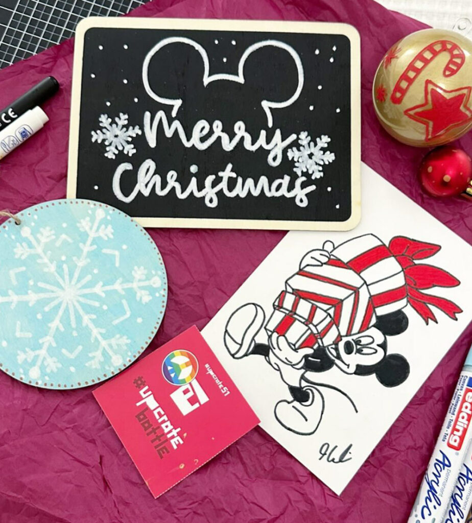
#upcratebattle
#upcrate51 Amazing entires <3
Topic: TOGETHER


#upcrate52
TOPIC: all good things are wild and free
a quote from henry david thoreau shows us the theme of this month’s upcratebattle. In this box, you don’t have the typical colors to celebrate the beauty of nature, but you can let it shine in a new light. The bold colors of the new Talens Pantone markers are perfect for bright surfaces and wild, freely drawn things. A waterfall? An animal? A landscape? Show us what wild and free means to you.
ALL YOU NEED TO DO IS:
1. Use the materials in this month‘s upcrate. Let your creativity run free and create a great work of art
2. Post your artwork on Instagram with #upcratebattle #upcrate52 tag us @upcrate
Deadline: 26.01.24
YOUR PRICE:
TALENS | PANTONE MIX BOX


